My Inflation Rate: Why Yours Isn't the Official Number
Your personal inflation rate depends on what you buy. How CPI weights work, a commuter vs a renter priced with BLS data, the 2026 gas spike and your raise.
Money··10 min read
The official inflation rate is the price change of an average urban household's spending. Your inflation rate is the price change of yours. In the 12 months to August 2026, the official CPI-U rose 3.4%. Priced with the same BLS data, a homeowner with a long drive to work saw about 4.1%, and a city renter without a car about 3.1%. Same prices, different baskets.
That's most of the answer to "why does inflation feel higher than the news says?" If more of your money goes on the things that went up fastest, your inflation is higher than the headline, and no amount of averaging changes that. The rest of this post shows how the official basket is weighted, works through those two households line by line, and covers the 2026 gasoline spike, the month of CPI data that doesn't exist, what an old dollar is worth, and how to check a raise.
All the numbers come from the Bureau of Labor Statistics data our Inflation Calculator uses, through August 2026, the latest month published when we wrote this.
How the official basket is weighted
The Consumer Price Index for All Urban Consumers (CPI-U) tracks prices category by category: rent, groceries, gasoline, car insurance, doctor visits and so on. To turn those into one number, BLS weights each category by its share of what urban households spend. That share is called its relative importance, and BLS publishes the table. The current one is for December 2025 and uses 2024 spending (BLS relative importance, December 2025).
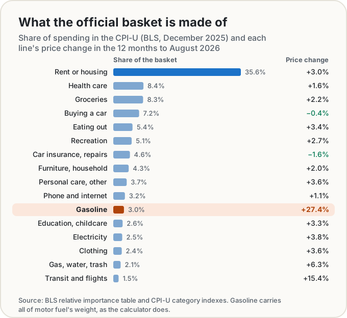
Two things stand out. Housing is more than a third of the basket on its own (shelter is 35.6%). And gasoline, the price everyone sees on a sign every day, is only about 3% of it: 2.9% for gasoline itself, 3.0% for all motor fuel.
That's why a gas price jump moves the official rate less than it moves your wallet, if you drive a lot. A line's effect on your rate is roughly its share of your spending × its price change. In the official basket, gasoline's 3% share times its 27.4% rise added about 0.9 of a point to the 12-month rate. If gas is 9% of your spending, it adds three times that.
One quirk worth knowing if you own your home: the CPI doesn't price house prices or mortgage payments. It treats a home you own as an investment, and prices the shelter it gives you by what it would rent for, called owners' equivalent rent (BLS fact sheet). If you have a fixed-rate mortgage, your actual housing payment may not have changed at all.
A worked example: a commuter and a renter
Here are two made-up households, each spending $4,500 a month. One owns a house in the suburbs and drives a long way to work. The other rents in a city and has no car.
| Each month | Commuter (owns, drives) | City renter (no car) |
|---|---|---|
| Rent or housing | $1,500 | $1,900 |
| Gasoline | $400 | $0 |
| Buying or leasing a car | $400 | $0 |
| Car insurance and repairs | $200 | $0 |
| Transit and flights | $0 | $150 |
| Groceries | $600 | $650 |
| Eating out | $250 | $450 |
| Electricity, gas, water, trash | $250 | $150 |
| Health care | $300 | $300 |
| Everything else | $600 | $900 |
| Total | $4,500 | $4,500 |
We priced each line with its own BLS index over the 12 months from August 2025 to August 2026, the way our My Inflation Rate calculator does. The commuter's housing uses owners' equivalent rent; the renter's uses rent of primary residence.
| Commuter | City renter | Official CPI-U | |
|---|---|---|---|
| The same spending a year earlier | $4,322 | $4,366 | |
| Inflation rate | 4.1% | 3.1% | 3.4% |
| Biggest driver | Gasoline, +2.0 points | Rent, +1.2 points | Shelter |
The commuter's rate is 0.7 of a point above the official one, and gasoline is almost all of the difference. Gas is 9% of this budget, three times its weight in the official basket, and it rose 27.4%, so it adds 2.0 points by itself. Housing adds another 1.0. The car itself helps a little: the price of buying a car fell 0.4% and the insurance and repairs line fell 1.6%, which together take off about 0.1 of a point.
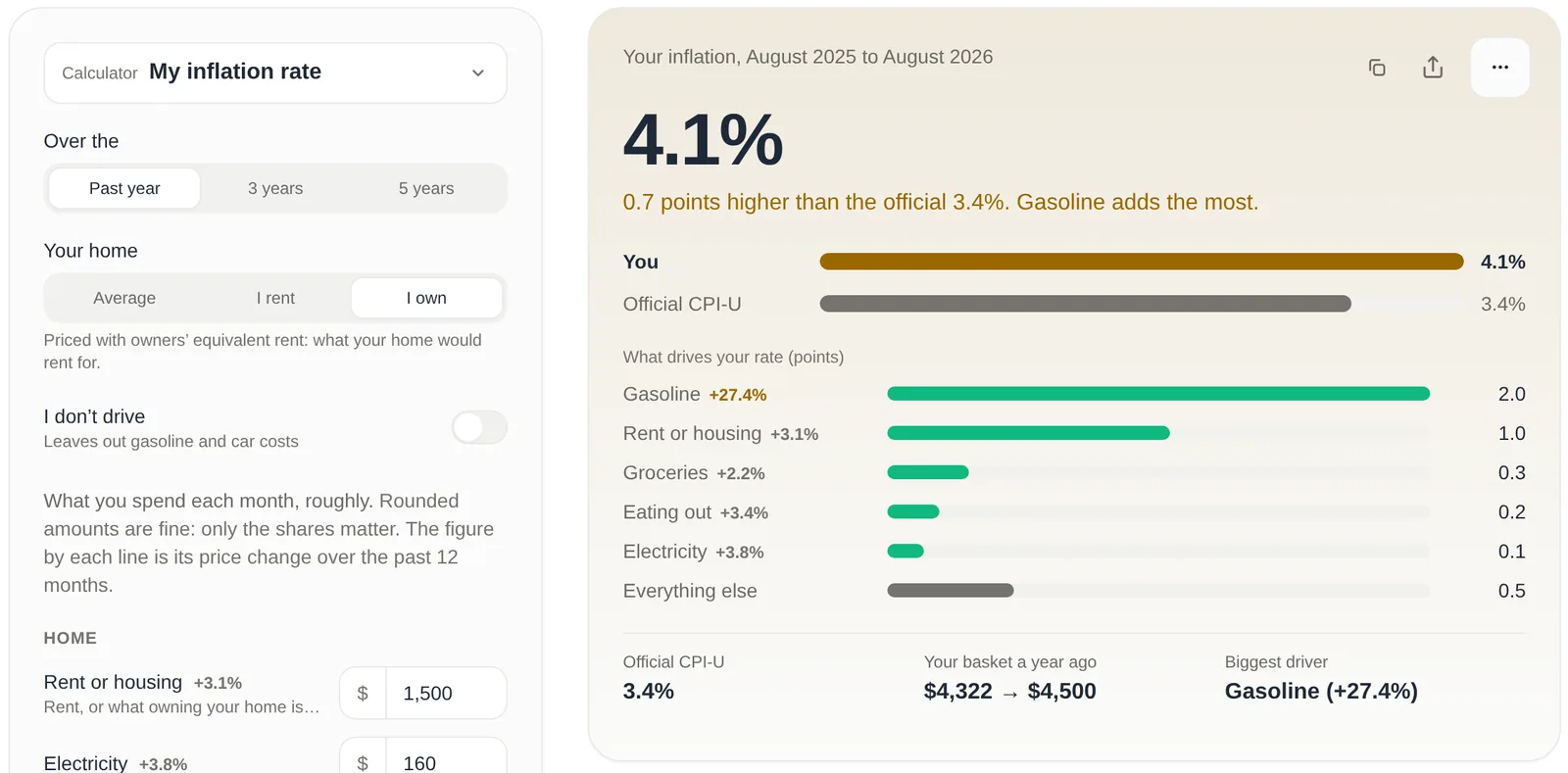
The renter comes in 0.3 of a point under the official rate. Rent rose 2.75%, a bit less than shelter as a whole, and with no car there's no gasoline at all. Not driving doesn't dodge everything, though: the transit and flights line, which includes airfares, rose 15.4%, so $150 a month of it adds half a point.
Between two households with the same income and the same total spending, that's a full point of difference. Over a decade, small gaps like that add up.
You can open both households in the calculator and change any line: the commuter and the renter. Rough numbers are fine: only the shares matter, so doubling every line gives the same rate. Nothing you type is saved or sent anywhere.
The 2026 gasoline spike
Gas is the reason inflation felt so different from one household to the next this year. The BLS gasoline index stayed within a few percent of where it started for most of 2025, slipped over the winter, then rose 50.7% between February and May 2026. By August it had come down from that peak but was still 27.4% above August 2025 (BLS CPI data).
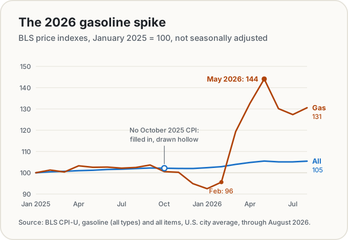
The official 12-month rate followed it up and partly back down: 2.4% in February, 4.2% in May, 3.4% in August (BLS, CPI-U all items). In May, gasoline was 40.5% above a year earlier, and priced the way our calculator does it, that alone added about 1.3 points to the official 4.2%. For someone with a long commute, the same jump moved their own rate by far more.
The arithmetic to keep in your head: your gas spending as a share of your total, times the change in the gasoline index. At 3% of spending and +27%, that's about 0.8 of a point. At 9%, it's about 2.4. (Strictly, the share that counts is the one a year earlier, when gas was cheaper and made up about 7% of the commuter's spending. That's why the calculator lands on 2.0 for them.)
The October 2025 gap
If you look up the CPI for October 2025, you won't find one. BLS published no all-items index for that month, and its footnote on the series says the data are unavailable because of the 2025 lapse in appropriations (BLS, CPI-U all items). Most category indexes are missing for that month too, and so are the 12-month changes that would have ended on it.
That matters if you want to compare against October 2025, for example a raise that started then. Our calculator fills the gap with the geometric mean of September (324.800) and November 2025 (324.122), which gives 324.461, and it tells you whenever a result uses that filled-in month. It never fills in anything else. The 12-month comparisons in this post run August to August, so none of them touch the gap.
What a dollar from a past year is worth
The same index answers the older question. A dollar from one year is worth the amount × CPI now ÷ CPI then. The CPI-U averaged 172.2 in 2000 and stood at 334.98 in August 2026, so $1 of 2000 prices costs 334.98 ÷ 172.2 = $1.95 now.
| $1 from | Costs this in August 2026 | Average a year |
|---|---|---|
| 1970 | $8.63 | 3.9% |
| 1980 | $4.07 | 3.1% |
| 1990 | $2.56 | 2.6% |
| 2000 | $1.95 | 2.6% |
| 2010 | $1.54 | 2.7% |
| 2020 | $1.29 | 4.3% |
These use each year's annual average CPI-U, the way BLS states "prices in 2000". The Inflation Calculator works out any amount between any two years or months since 1913. Keep in mind that it's the average basket again: your own dollar from 2020 may have lost more or less than that, depending on what you buy.
Did your raise keep up?
A raise only counts if it beats prices. Take someone on $60,000 in August 2025 who got 3% and earns $61,800 in August 2026. Prices rose 3.4% over those months, so keeping up would have needed $62,038. The raise is 0.4% behind, $238 a year short.
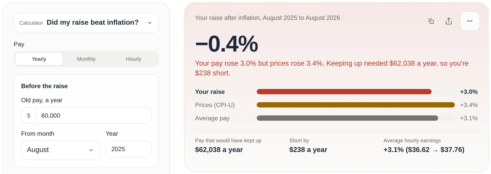
The calculator also shows how pay in general did: average hourly earnings for private-sector workers rose 3.1% over the same months, from $36.62 to $37.76 (BLS, average hourly earnings). So in this example the typical worker also fell a hair behind prices, and a 3% raise was close to normal.
Now combine it with your own rate. For the commuter above, whose prices rose 4.1%, the same 3% raise is about 1.1% behind, not 0.4%. For the renter, at 3.1%, it's almost exactly even. The raise calculator uses the official CPI-U, so if your own rate is higher, treat its answer as the best case.
What to do with your number
Your rate is most useful as a yardstick. Use it when you ask for a raise, set a budget for next year, or judge whether savings interest is really earning anything. If it's well above the official rate, the driver list tells you where: for a lot of households in 2026, that's the gas tank, and that's also the line where a change (carpooling, a transit pass, a closer job) moves your inflation the most.
Work out your own rate in a couple of minutes. It starts on the official basket, so the first answer is 3.4%; every number you change shows how your spending differs.
Share this post
Keep reading
Money· Oct 11, 2026· 11 min
How Much Have People Saved for Retirement by Age? (2025 Data)
Median and mean 401(k) and IRA balances by age from the Fed's 2025 survey, the 45% of families with no account at all, and why the median is the fair number.Money· Oct 11, 2026· 10 min
What Household Income Is Top 10%, 5% or 1%? (2025 Data)
The family income it takes to reach the top 10%, 5% and 1% in the Fed's 2025 survey, overall and by age, the median by age, and what counts as income.Money· Oct 10, 2026· 10 min
Net Worth by Age in 2025: What the Fed's New Survey Says
Median and average net worth by age from the Fed's 2025 survey: $33,000 under 35, $504,900 at 75+, what the top 10% takes, and why the average misleads.