Color Picker from Image
Drop, paste or choose a photo, then hover or tap to pick a colour through the magnifier. The palette and every colour code are worked out in your browser: the picture is never uploaded.
Colours in the palette
Palette colour 1 of 6
#50487A
Muted blue, about 33% of the picture. Closest CSS name: darkslateblue.
Width = share of the picture. Tap a colour, or pick your own from the photo.
- HEX#50487A
- RGBrgb(80, 72, 122)
- HSLhsl(250, 26%, 38%)
- HSVor HSBhsv(250, 41%, 48%)
- CMYKnaive, no profilecmyk(34%, 41%, 0%, 52%)
- OKLCHoklch(43.3% 0.081 289.9)
- LABCIELAB, D65lab(33.4% 15.9 -27.3)
- CSS nameclosestdarkslateblue
Contrast between the palette’s colours
WCAG 2.2 ratio for each pair as text and background. Green passes AA for body text (4.5:1), amber only for large text (3:1).
| Colour | #50487A | #3E6029 | #6A913F | #EFA980 | #B7748F | #B82119 |
|---|---|---|---|---|---|---|
| #50487A | 1.1 | 2.2 | 4.1 | 2.3 | 1.2 | |
| #3E6029 | 1.1 | 1.9 | 3.6 | 2.0 | 1.1 | |
| #6A913F | 2.2 | 1.9 | 1.8 | 1.0 | 1.7 | |
| #EFA980 | 4.1 | 3.6 | 1.8 | 1.8 | 3.2 | |
| #B7748F | 2.3 | 2.0 | 1.0 | 1.8 | 1.8 | |
| #B82119 | 1.2 | 1.1 | 1.7 | 3.2 | 1.8 |
How this works: Method, 7 sources, Checked against 1 worked example,
How this works
Method
A photo is a grid of pixels, and each pixel stores three numbers from 0 to 255 for red, green and blue. When you point at the picture, the page maps the pointer’s position to the pixel underneath it and reads those three numbers straight from the decoded image. Nothing is guessed or smoothed: the hex code is that pixel, and the magnifier shows the eleven by eleven pixels around it so you can land on exactly the one you want. Full method
Sources
- Arthur and Vassilvitskii (2007), k-means++: The Advantages of Careful Seeding
- Björn Ottosson (2020), A perceptual color space for image processing
- W3C: WCAG 2.1, Success Criterion 1.4.3 Contrast (Minimum)
- W3C, WCAG 2.2: definitions of contrast ratio and relative luminance
- W3C, CSS Color Module Level 4
- Myndex, SAPC-APCA documentation (APCA-W3 0.0.98G-4g)
- Machado, Oliveira and Fernandes (2009), A Physiologically-based Model for Simulation of Color Vision Deficiency
How it’s tested
One worked example for this page is checked by automated tests before every release: given the inputs, the tool must show the expected answer.
Changes
- Added eight pages: a colour picker for photos, a WCAG 2.2 and APCA contrast checker, a palette generator, a colour blindness simulator, and hex, RGB and CMYK converters.
- Redesigned: paste a colour in any format, HSV and CMYK added, opacity, a contrast check against white and black text, and colour harmonies.
- Fixed a crash when opening the colour picker.
- First published.
How the picker reads a colour from a photo
A photo is a grid of pixels, and each pixel stores three numbers from 0 to 255 for red, green and blue. When you point at the picture, the page maps the pointer’s position to the pixel underneath it and reads those three numbers straight from the decoded image. Nothing is guessed or smoothed: the hex code is that pixel, and the magnifier shows the eleven by eleven pixels around it so you can land on exactly the one you want.
Photos are noisy. A blue sky that looks flat has pixels a few steps lighter and darker than each other, and the edge of an object mixes the two colours on either side. If the colour you get looks slightly off, move a pixel or two into the middle of the area, or use the palette, which averages whole regions for you.
The palette groups the picture’s pixels into clusters of similar colours with k-means, measured in OKLab, where equal distances look like equal differences to the eye. The starting colours are chosen with k-means++, which favours colours far from those already picked, so a small bright detail gets its own swatch instead of being swallowed by a large dull area. The random choices use a fixed seed: the same picture always gives the same palette.
pixel (x, y) → bytes at 4 × (y × width + x): red, green, blue
- k-means++ seeding picks each new starting centre with a probability proportional to its squared distance from the centres already chosen, which makes the clustering both faster and more reliable than random starts. Source: Arthur and Vassilvitskii (2007), k-means++: The Advantages of Careful Seeding.
- OKLab was designed so that the same numeric step looks like the same amount of change in lightness, hue and colourfulness, and CSS now supports it as oklab() and oklch(). Source: Björn Ottosson (2020), A perceptual color space for image processing.
The example photo’s palette
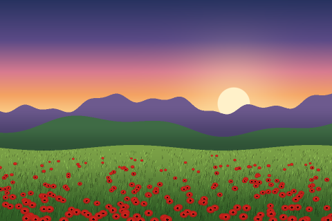
The six colours the picker finds in the poppy field, with each one’s share of the picture and the more readable text colour on it.
| Colour | RGB | Share | Best text | Contrast |
|---|---|---|---|---|
| #50487A | rgb(80, 72, 122) | 33% | White | 8.23:1 |
| #3E6029 | rgb(62, 96, 41) | 21% | White | 7.21:1 |
| #6A913F | rgb(106, 145, 63) | 16% | Black | 5.73:1 |
| #EFA980 | rgb(239, 169, 128) | 13% | Black | 10.65:1 |
| #B7748F | rgb(183, 116, 143) | 12% | Black | 5.90:1 |
| #B82119 | rgb(184, 33, 25) | 6% | White | 6.42:1 |
Frequently Asked Questions
Is my photo uploaded anywhere?
No. The browser decodes the picture on your device and the page reads its pixels there. There is no server that receives it, and when you leave the page or choose another picture the copy in memory is released. You can turn off your connection after the page has loaded and the picker still works.
How do I pick a colour from a screenshot?
Take the screenshot, then press Ctrl+V (⌘V on a Mac) on this page: a pasted image opens straight away. You can also drop a file onto the picture or use Choose a photo. On a phone, pick a screenshot from your photo library.
Why is the colour different from what I see in my photo app?
Some phones save pictures in a wider colour space (Display P3) and some apps adjust colours on display. The browser converts the picture to sRGB for the page, so a very saturated colour can come out slightly less vivid here. For web and most design work, sRGB values are the ones you want.
How many colours should the palette have?
Five or six capture most photos: a dominant background, one or two mid tones and an accent. Ask for eight or ten to see the smaller details split out, such as the dark and light sides of the same object. The shares under the swatches tell you how much of the picture each colour stands for.