Color Blindness Simulator
Drop in a photo, a chart or a screenshot and drag the divider to compare. Choose the kind and strength of colour blindness; the page also lists the colours in it that become hard to tell apart.
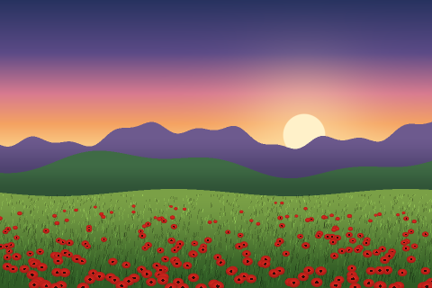 OriginalDeuteranopia
Simulating
Deuteranopia
Green-sensitive (M) cones are missing or shifted, the most common kind: red, orange, yellow and green are easy to confuse.
The picture’s colours, seen with deuteranopia
Each colour as it is (top) and as simulated (bottom).
- #50487A
- #3E6029
- #6A913F
- #EFA980
- #B7748F
- #B82119
Hard to tell apart
- #3E6029 and #B8211924 → 8 apart
- #6A913F and #B7748F20 → 9 apart
- #6A913F and #B8211926 → 9 apart
Distances in OKLab ×100; under about 10 reads as the same colour at a glance. Add a label, pattern or a lightness difference so the meaning doesn’t rest on hue.
All four at 100% strength
Kind of colour vision
100% is dichromacy (one cone type missing); lower is anomalous trichromacy, a shifted cone.
How this works: Method, 9 sources, Checked against 2 worked examples,
How this works
Method
Colour vision starts with three kinds of cone cell in the retina, most sensitive to long (red), medium (green) and short (blue) wavelengths. In colour vision deficiency one kind is missing (dichromacy, the -opia types) or its sensitivity is shifted towards another kind (anomalous trichromacy, the -omaly types), so colours that differ mainly in what that cone sees become hard or impossible to tell apart. Full method
Sources
- Wikipedia, Color blindness: epidemiology (after Birch 2012)
- National Eye Institute, Types of Color Vision Deficiency
- MedlinePlus Genetics, Achromatopsia
- W3C: WCAG 2.1, Success Criterion 1.4.3 Contrast (Minimum)
- W3C, WCAG 2.2: definitions of contrast ratio and relative luminance
- W3C, CSS Color Module Level 4
- Björn Ottosson (2020), A perceptual color space for image processing
- Myndex, SAPC-APCA documentation (APCA-W3 0.0.98G-4g)
- Machado, Oliveira and Fernandes (2009), A Physiologically-based Model for Simulation of Color Vision Deficiency
How it’s tested
2 worked examples for this page are checked by automated tests before every release: given the inputs, the tool must show the expected answer.
Changes
- Added eight pages: a colour picker for photos, a WCAG 2.2 and APCA contrast checker, a palette generator, a colour blindness simulator, and hex, RGB and CMYK converters.
- Redesigned: paste a colour in any format, HSV and CMYK added, opacity, a contrast check against white and black text, and colour harmonies.
- Fixed a crash when opening the colour picker.
- First published.
How the simulation works
Colour vision starts with three kinds of cone cell in the retina, most sensitive to long (red), medium (green) and short (blue) wavelengths. In colour vision deficiency one kind is missing (dichromacy, the -opia types) or its sensitivity is shifted towards another kind (anomalous trichromacy, the -omaly types), so colours that differ mainly in what that cone sees become hard or impossible to tell apart.
The page uses the model of Machado, Oliveira and Fernandes (2009). It simulates how the cones’ signals are combined further along the visual system, and it handles both the shifted and the missing cone in one framework, with strength from 0 to 100%. The authors published a matrix for every 10% of strength; for each pixel the page converts the colour to linear light, multiplies it by the matrix and converts it back. Achromatopsia is shown as the colour’s luminance in grey.
A simulation is an approximation of the average experience, not what any one person sees, and people with the same diagnosis vary. Use it to find problems: two lines of a chart that merge, a red error and a green success that look alike, a map key that stops working. Then fix them with more than hue, by adding labels, patterns, icons or a clear difference in lightness.
[R′ G′ B′] = M(type, strength) × [R G B], in linear light
- Red-green colour blindness affects up to 1 in 12 men (8%) and 1 in 200 women (0.5%) of Northern European descent; deuteranomaly alone accounts for about 5% of men. Source: Wikipedia, Color blindness: epidemiology (after Birch 2012).
- The National Eye Institute lists red-green colour blindness as the most common type, with blue-yellow types and complete colour blindness (monochromacy) much rarer. Source: National Eye Institute, Types of Color Vision Deficiency.
- Achromatopsia affects an estimated 1 in 30,000 people worldwide. Source: MedlinePlus Genetics, Achromatopsia.
Kinds of colour vision deficiency
Each kind with the cones affected, how common it is among people of Northern European descent (achromatopsia worldwide), and what the poppy red #B82119 becomes in the simulation (the -omaly rows at 60% strength).
| Kind | Cones | How common | Poppy red becomes |
|---|---|---|---|
| Protanopia | Red (L) cones | 1.3% of men, 0.02% of women | #534A15 |
| Protanomaly | Red (L) cones | 1.3% of men, 0.02% of women | #7A4612 |
| Deuteranopia | Green (M) cones | 1.2% of men, 0.01% of women | #786A0E |
| Deuteranomaly | Green (M) cones | 5% of men, 0.35% of women: the most common | #885D0F |
| Tritanopia | Blue (S) cones | About 0.008% of men and of women | #CB0022 |
| Tritanomaly | Blue (S) cones | Very rare | #C0001D |
| Achromatopsia | All cones | About 1 in 30,000 people | #5F5F5F |
Frequently Asked Questions
Is my picture uploaded?
No. The picture is decoded by your browser and shown through a filter on this page; the download is worked out on your device too. Nothing is sent anywhere, and the picture is released from memory when you leave or choose another.
Which kind should I check first?
Deutan, then protan: together they cover almost everyone with colour vision deficiency. If your design passes those at full strength, it will almost always work for the milder forms. Check tritan as well for blue and yellow pairs, and achromatopsia to see whether lightness alone carries the meaning.
How accurate is it?
The Machado model was compared with the colour judgements of people with colour vision deficiency in the original study and is widely used by browser and design tools. It shows a typical case; individual vision differs, especially for anomalous trichromacy, so treat it as a strong check, not a guarantee.
How do I make a chart readable for colour-blind people?
Use colours that differ in lightness as well as hue, label lines directly instead of relying on a colour key, and add markers or dashes. The list of colours that become hard to tell apart shows which pairs in your picture to change first.