How to Read an AGP Report, Step by Step
A walk through the one-page ambulatory glucose profile (AGP) from a CGM: data check, time in ranges, glucose metrics, the percentile curve and daily views.
Health & science··8 min read
If you wear a continuous glucose monitor, sooner or later someone hands you a one-page printout with a coloured bar, a few numbers and a shaded wave across a 24-hour axis. That's the ambulatory glucose profile, or AGP report.
It packs two weeks of readings, a few thousand of them, onto one page, and it's laid out in the order a clinician reads it. Once you know that order, it takes a couple of minutes.
Where the AGP comes from
The AGP was first developed by Mazze and colleagues in 1987 and later refined by the International Diabetes Center in Minnesota. In 2012, an expert panel convened by the International Diabetes Center reviewed it and recommended a standard, uniform glucose report, so that every device and clinic would show the same picture (Bergenstal et al., 2013). The 2019 international consensus on time in range backed the same idea: a single-page report the care team can review together with you and keep in your record (Battelino et al., 2019).
Many CGM programs print a version of it. The current template from the International Diabetes Center is version 5.0. Layouts differ slightly between brands, but the sections are the same.
Step 1: Check there's enough data
Before reading any number, look at the top corner for two things:
- How many days the report covers. The consensus recommends 14 days.
- Time CGM active, the share of those days the sensor actually recorded. The goal is at least 70%.
The 14-day figure isn't arbitrary. The 2013 panel found that 14 days of CGM data gave a stable, accurate picture of the key metrics. With a week of data, or a sensor that kept dropping out, one unusual day can move every number on the page. If coverage is low, read the rest as a rough sketch.
Step 2: Read the time-in-ranges bar, bottom first
The coloured bar shows how the readings split across five bands: very low (under 54 mg/dL), low (54–69), in range (70–180), high (181–250) and very high (over 250). Beside it are the goals for most adults with type 1 or type 2 diabetes:
| Band | Goal |
|---|---|
| Below 54 mg/dL (3.0 mmol/L) | under 1% |
| Below 70 mg/dL (3.9 mmol/L), in total | under 4% |
| 70–180 mg/dL (3.9–10.0 mmol/L) | over 70% |
| Above 180 mg/dL (10.0 mmol/L), in total | under 25% |
| Above 250 mg/dL (13.9 mmol/L) | under 5% |
Start at the bottom of the bar. Step-by-step guides for clinicians put low glucose first (Ekhlaspour et al., 2019), and the consensus goals for lows are the strictest on the page. Then look at time in range, then time above.
Two conversions help. Each 1% of time is about 15 minutes a day, so 4% below 70 is about an hour a day. And the goals nest: "under 4% below 70" includes the very low time, and "under 25% above 180" includes the very high time.
Version 5.0 of the report adds time in tight range, 70–140 mg/dL, with a goal of over 50%. It's newer than the 2019 targets and not every report shows it yet.
For more on where these targets come from, and on different goals for older adults and pregnancy, see time in range explained.
Step 3: Read the glucose statistics
Next to the bar you'll find three numbers:
- Average glucose. The mean of all sensor readings.
- GMI (glucose management indicator). An A1C-style estimate worked out from that average: GMI (%) = 3.31 + 0.02392 × average mg/dL (Bergenstal et al., 2018). It often differs from a lab A1C by a few tenths of a point, so treat it as a companion to your lab result, not a replacement.
- Glucose variability (%CV). The coefficient of variation: the standard deviation divided by the average. The consensus goal is 36% or less.
CV is the number people most often skip, and it's worth a moment. Two people with an average of 150 mg/dL can have a standard deviation of 45 (CV 30%) or 60 (CV 40%). The second person's readings are spread much wider around the same average, which usually means more highs and more lows. A falling CV over a few reports means the days are getting steadier.
Step 4: Read the AGP curve
This is the shaded wave in the middle, and it's the part that answers when. The report takes every day in the period and folds them onto a single 24-hour axis, as if they all happened on one day. At each time of day it draws:
- a thick line: the median (50th percentile), where your glucose typically was at that time;
- a darker band: the 25th to 75th percentiles, the middle half of all readings at that time;
- a lighter band: the 5th to 95th percentiles, 90% of readings. (Some older reports and papers use the 10th and 90th instead.)
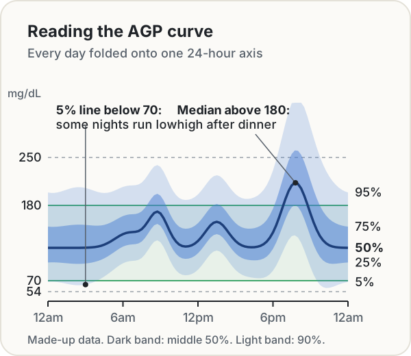
If percentiles feel slippery, our percentiles explainer covers the idea. For the AGP, three questions do most of the work:
- Where is the median? A median above 180 at a certain hour means you were usually high at that time, not just once.
- How wide is the dark band? A narrow band means your days look alike at that hour. A wide one means they don't: different meals, different timing, different activity.
- Where do the thin lines go? The 5th percentile line dipping below 70 means that on some days, at that time, you went low. The 95th line above 250 means occasional big highs.
Then scan the clock in sections. Overnight (midnight to 6am) shows lows you may sleep through and any early-morning rise. Around meals, the height and width of each bump show how big and how consistent the rises are. Day-versus-night patterns and meal-time rises are exactly what the review above suggests looking for.
The illustration above shows two patterns worth raising at an appointment: a median above 180 after dinner on most days, and a low tail overnight on some nights.
Step 5: Check the daily profiles
The bottom of the report shows each day as its own small chart, midnight to midnight. Use it to test what the curve suggested:
- Is the overnight low tail one bad night or a pattern across many nights?
- Do weekends look different from weekdays?
- Did a sick day, a trip or a sensor change produce a run of odd readings?
A percentile curve can't tell a single bad night from a habit. The daily views can.
Step 6: Write down two questions
The report is built for a conversation, not for adjusting treatment on your own. A useful way to finish is to note one or two specific observations, for example "the 5% line is under 70 between 2 and 4am" or "the median is above 180 for three hours after dinner", and bring them to your care team. Specific times are much easier to act on than "my numbers are high". Decisions about medication or doses belong with them.
If you use a finger-stick meter
The International Diabetes Center also publishes an AGP for finger-stick (SMBG) readings. The idea is the same, but with four or five readings a day the curve is far less certain: a half-hour slot might hold only a few readings across two weeks.
Our blood sugar log handles this openly. Its time-of-day chart draws the median and percentile bands the same way, in half-hour slots, but only when every slot has at least 5 readings on 5 or more days. Otherwise it shows each reading as a dot, so you can see the spread without a band that pretends to more precision than the data has. If you have a CGM, you can import a Dexcom Clarity or LibreView export and get the full curve, the five-band bar, GMI and CV, plus a printable one-page report. Nothing is uploaded: the file is read in your browser.
The short version
- Data: 14 days, sensor active at least 70%.
- Bar: start with time below 70 and below 54, then time in range, then time above.
- Numbers: average, GMI and CV (36% or less).
- Curve: median height, band width, and where the thin lines go, hour by hour.
- Daily views: pattern or one-off?
- Questions: write down one or two specific times to discuss.
Sources
- Bergenstal, R. M., et al. (2013). Recommendations for standardizing glucose reporting and analysis to optimize clinical decision making in diabetes: the Ambulatory Glucose Profile (AGP). Journal of Diabetes Science and Technology, 7(2), 562–578. PMC3737658
- Battelino, T., et al. (2019). Clinical targets for continuous glucose monitoring data interpretation: recommendations from the international consensus on time in range. Diabetes Care, 42(8), 1593–1603. PMC6973648
- Ekhlaspour, L., Tabatabai, I., & Buckingham, B. (2019). A review of continuous glucose monitoring data interpretation in the age of automated insulin delivery. Journal of Diabetes Science and Technology, 13(4), 645–663. PMC6610610
- Bergenstal, R. M., et al. (2018). Glucose Management Indicator (GMI): a new term for estimating A1C from continuous glucose monitoring. Diabetes Care, 41(11), 2275–2280. PMC6196826
- International Diabetes Center. AGP Report: Continuous Glucose Monitoring v5.0 and SMBG AGP Report v5.0. agpreport.org
Keep reading
Health & science · Oct 7, 2026 · 9 min
Time in Range Explained: What 70–180 mg/dL Means
What blood sugar time in range measures, the international consensus targets, how it lines up with A1C and GMI, and what finger-stick readings can tell you.
Health & science · Oct 7, 2026 · 8 min
Tabata vs HIIT: What the Original Study Did and How to Time It
What the 1996 Tabata study actually tested, how gym Tabata differs, and how to time Tabata, 30/30, EMOM, boxing rounds and sprint intervals safely.
Health & science · Jul 18, 2026 · 3 min
How to Measure Penis Size: Bone-Pressed vs Non-Bone-Pressed
A clinical guide to measuring penile length and girth the way research studies do, including the bone-pressed vs non-bone-pressed difference.
Health & science · Oct 7, 2026 · 9 min
Time in Range Explained: What 70–180 mg/dL Means
What blood sugar time in range measures, the international consensus targets, how it lines up with A1C and GMI, and what finger-stick readings can tell you.
Health & science · Oct 7, 2026 · 8 min
Tabata vs HIIT: What the Original Study Did and How to Time It
What the 1996 Tabata study actually tested, how gym Tabata differs, and how to time Tabata, 30/30, EMOM, boxing rounds and sprint intervals safely.
Health & science · Jul 18, 2026 · 3 min
How to Measure Penis Size: Bone-Pressed vs Non-Bone-Pressed
A clinical guide to measuring penile length and girth the way research studies do, including the bone-pressed vs non-bone-pressed difference.